Sant’Anna BEST
An identity that stands out.
01 / The concept
A name that becomes an identity.
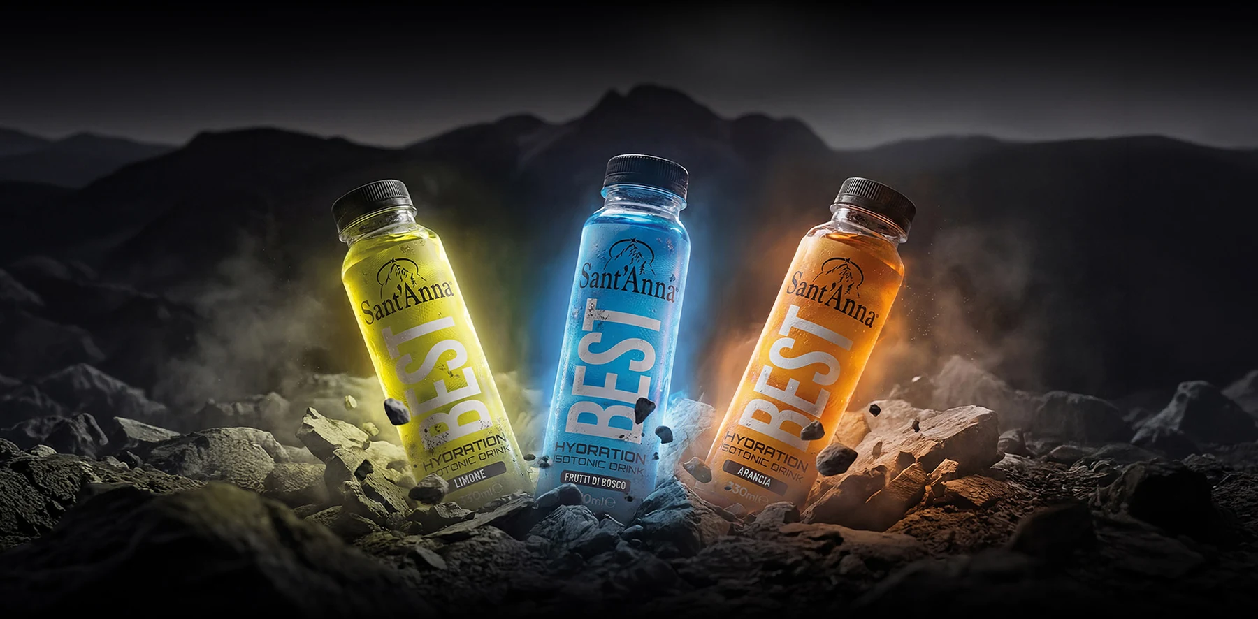
For Sant’Anna BEST, I led the beverage concept, label design and creative direction. The vertical name and colour system make the range instantly recognisable, from a single bottle to the campaign visual.
02 / The packaging
Three flavours. One visual language.
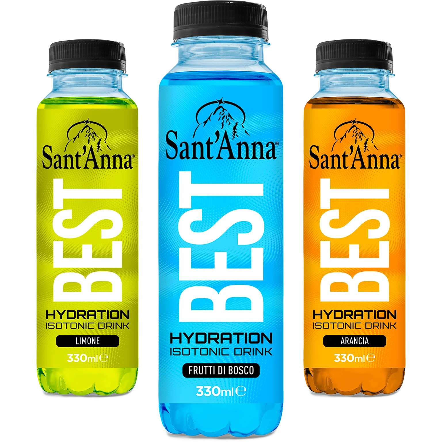
BEST is the signature. Colour is the code.
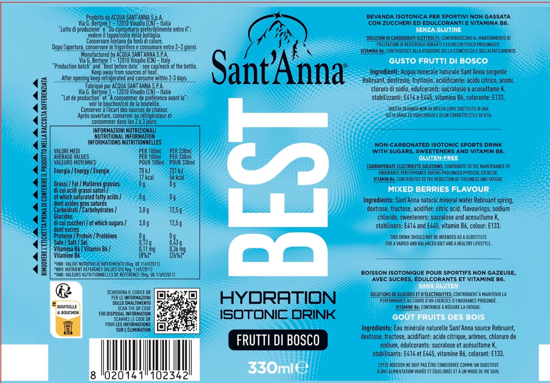
The name runs vertically, shaping the bottle’s visual rhythm. Lemon, Mixed Berries and Orange share the same structure and proportions; colour distinguishes the flavours while keeping the range unified.
The outcome
One identity across every application.
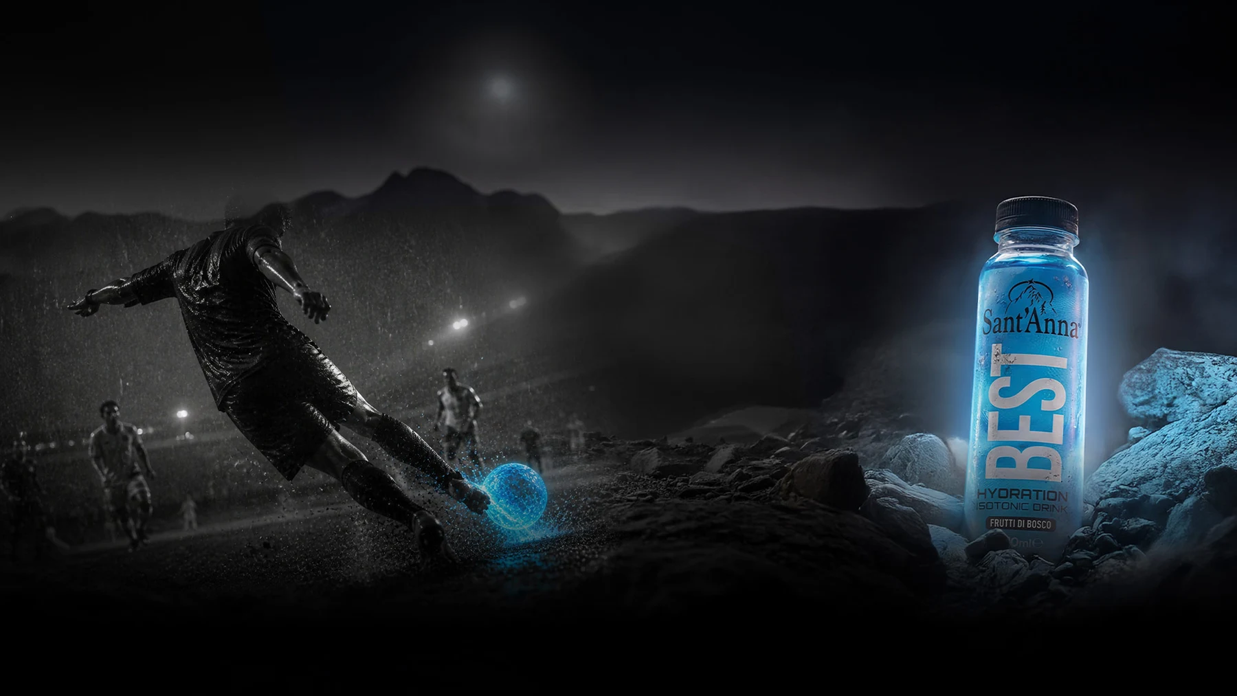
The vertical name and colour create a recognisable range identity, carried from the packaging into communication materials.
Design and creative direction
Alessandro Pacente
My contribution
Product concept, label design, creative direction and communication.
Original project materials: Sant’Anna visuals, packaging and applications.