Sant’Anna PRO
From idea to product.
01 / The concept
A product idea. A distinctive presence.
I developed Sant’Anna PRO from the beverage concept through to packaging and communication. The challenge was to give the new line a personality of its own, while keeping its connection to Sant’Anna clear.
02 / The packaging
Two flavours. A clear hierarchy.
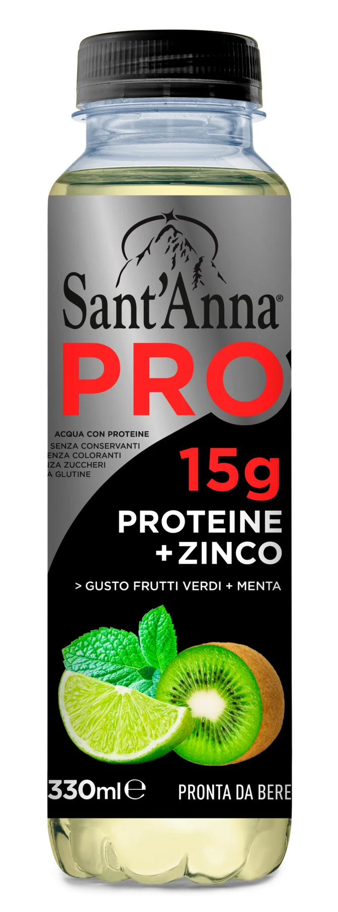
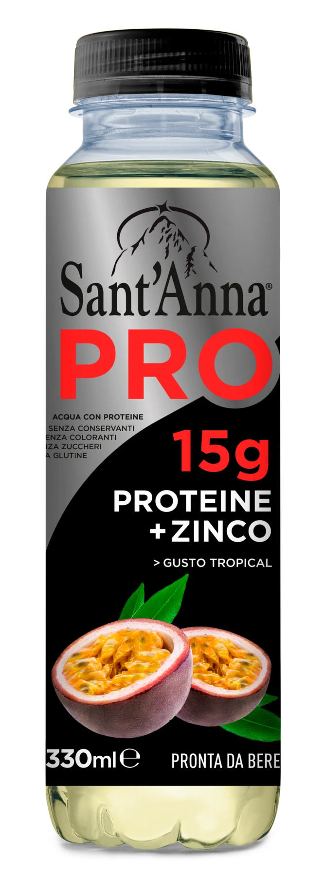
The hierarchy starts with the name.
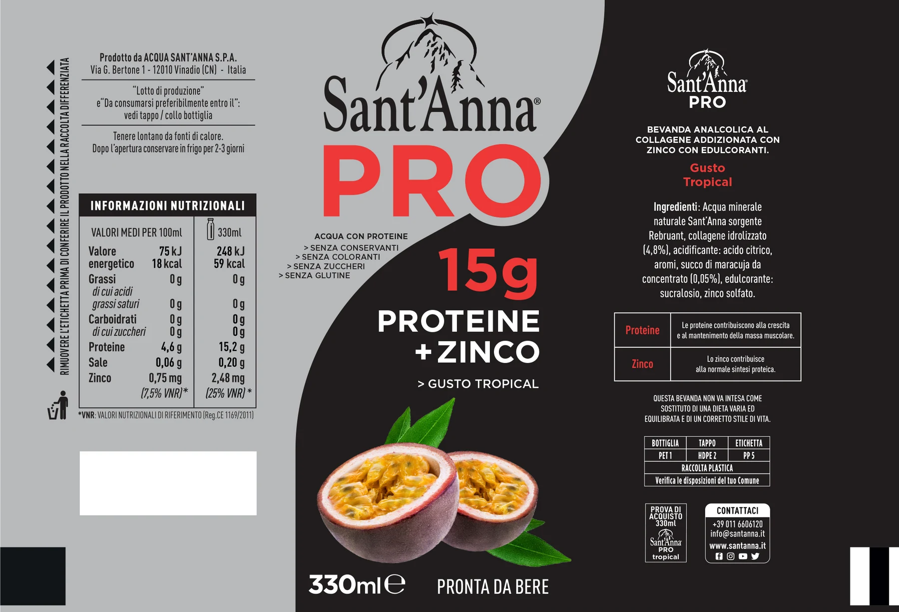
PRO leads the label. The Sant’Anna brand and product information have clearly defined positions, while colour differentiates Green Fruits + Mint from Tropical. One visual structure makes both variants easy to recognise.
03 / Communication
From the pack to the point of sale.
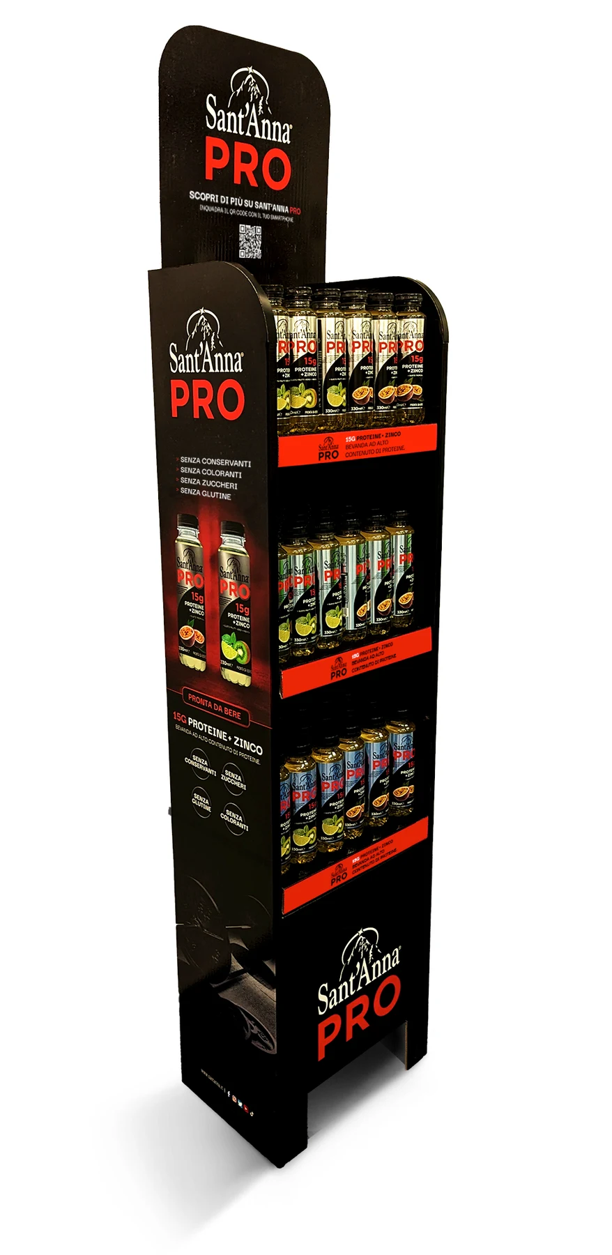
New formats. Still PRO.
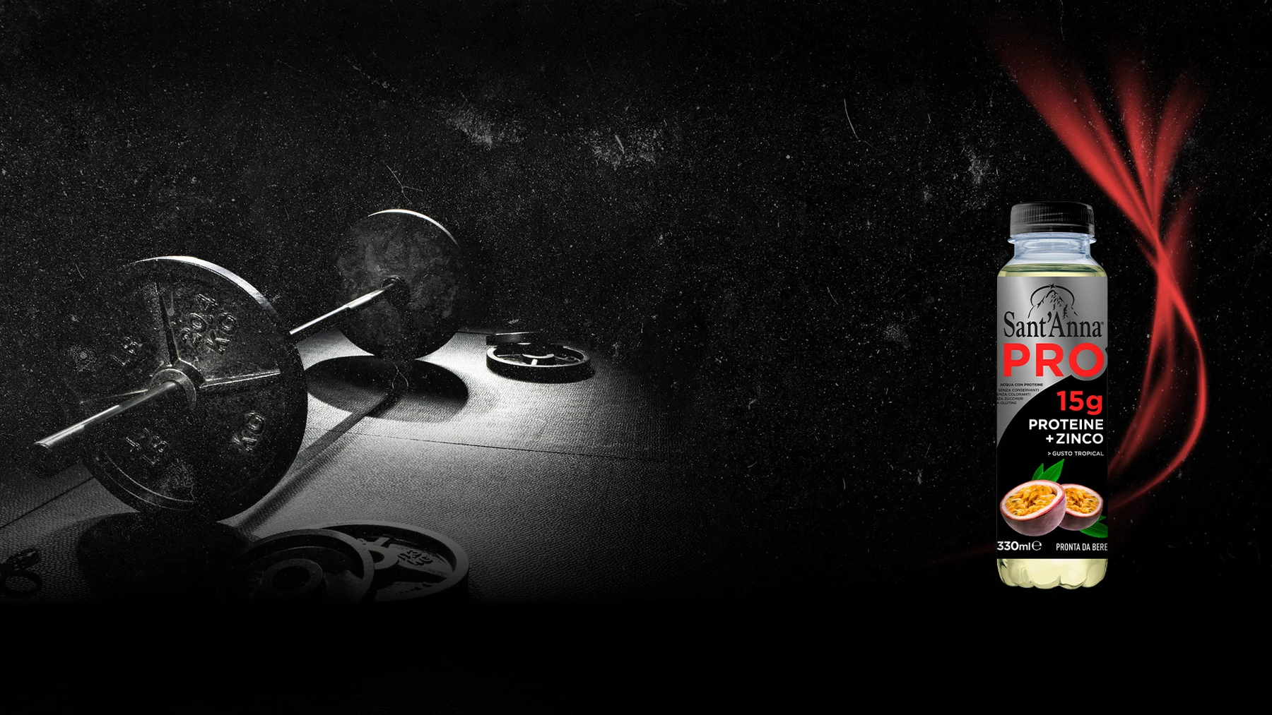
I carried the pack’s name, contrasts and hierarchy into the retail display and digital visuals. The composition adapts to each format while the product retains its distinctive presence.
The product on santanna.itThe outcome
From concept to communication.
Product concept, label design and communication follow the same creative direction, from the bottle to the materials that introduce it.
Design and creative direction
Alessandro Pacente
My contribution
Product concept, label design, creative direction and communication.
Original project materials: Sant’Anna visuals, packaging and applications.