santanna.it

One shared identity. Worlds to explore.

Client
Acqua Sant’Anna
Creative direction
Alessandro Pacente
Scope
Digital rebranding · UX/UI · Creative direction

01 / The vision

A world for every range. One coherent experience.

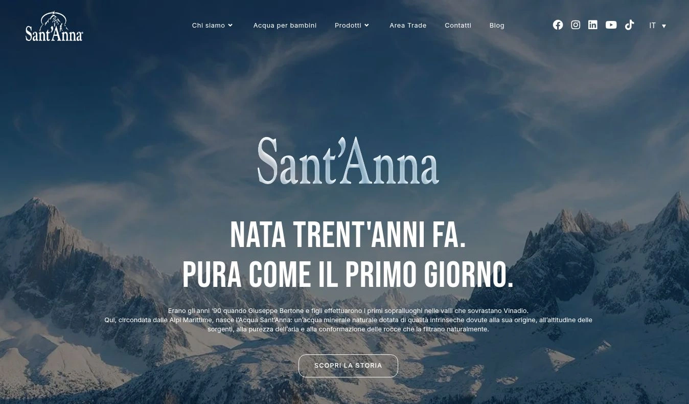
I conceived and built the digital rebranding of santanna.it, from creative direction to UX/UI. Each drink has its own colour, atmosphere and story, almost like a brand in its own right. Navigation, typography and composition bring those identities together.

santanna.it
santanna.it homepage

02 / The product pages

Colour opens the story.

Acqua Sant’Anna · Blue · Origin · Lightness

It all starts with water.

Sant’Anna blue provides continuity. The hero connects the bottle with family life; formats, key figures and further information turn that first impression into a journey through the product.

Explore Acqua Sant’Anna
SanThè · Yellow · Orange · Flavour

A warm world built around flavour.

Lemon and peach colour the screen. Fruit and bottles extend beyond the hero background to give the page depth. The story continues through infusion, ingredients and variants, including Decaffeinated and Zero.

Explore SanThè
SanFruit · Orange · Energy · Fruit

Flavour becomes imagery.

Intense orange, fruit and splashes give the page an immediate, lively character. That energy carries through the presentation of all three flavours: the product is recognisable before you even read the description.

Explore SanFruit
Beauty · Pink · Softness · Care

A visual language drawn from beauty.

Pink, petals and portraiture shift the tone towards a softer world of self-care. The Collagene and Hyaluronic Acid sections maintain this atmosphere, with information organised by product line.

Explore Beauty
Sant’Anna BEST · Black · Electric blue · Sport

Energy sets a different pace.

A dark background, a sporting scene and the product’s luminous blue create a more intense world. BEST has its own voice while sharing the site’s navigation and structure: the atmosphere changes, but the experience remains familiar.

Explore Sant’Anna BEST

03 / The brand story

A story to move through.

For Sant’Anna’s history, navigation becomes a timeline. Dates, archive imagery and company milestones alternate as you scroll, while the Alpine landscape keeps the connection to the brand’s origins in view. The corporate story takes on a visual rhythm, from the spring to the evolution of the products.

Explore the history
Screenshot of the timeline on the Sant’Anna website.

The outcome

Distinct identities, one shared experience.

The rebranding extends from the homepage to five product families and the brand’s history. Colour and atmosphere distinguish the ranges; structure, typography and navigation keep the experience consistent.

Design and creative direction

Alessandro Pacente

My contribution

Concept, digital rebranding, art direction, UX/UI and website implementation.

Screenshots show the live website: homepage, five product families and the History page. The historical materials shown belong to the Sant’Anna archive.

Next project

Sant’Anna PRO